Thursday 17 December 2009

End of Term Review


BOY XOOX IMAGE FROM PERSONAL PROJECT

During this term, I have been developing my skills and working on my own illustration style. This has moved me to take a graphic designers approach because I’ve been following the design principles. There were five main projects this term and each had differing outcomes.
For my personal project, I wanted to create a working library of objects that were interchangeable allowing me to re-use elements wherever a design aloud this. So eyes could also be wheels and so on. What I found out about this is there are limitations to how much a detail an element can hold. Testing them help me understand what worked. A lot of symmetry and paternal worked well, it was mostly the simpler ones with forty-five degree angle triangles, squares and circles. I produced some posters using this method and I used a grid and a black illustrator outline. This gave very structured designs that had a bold directness due to their uniformity. If I continued to work this way I would have to answer most if not all briefs set directly objectively. This directness pay off due to shape relation, this is a good thing for me to grasp for later projects. As far as reference goes I have been looking a lot in pattern books and generally simple design like building blocks.
The next project was the times cover project, I started by drawing ideas that I thought would work with the design system I created. It was funny that I had to remake most of the shapes again as they were not fitting into place, so there were some design issues emerging because I wanted it to look dynamic and slot together better, Also I used new shapes because I wanted it in colours that related to the project, in this case science. To add more dynamics I re-used a black line for the three spot images and drop the black line for the cover. This then made me think do I even need the black line, it isn’t adding to anything maybe it was just a comfort thing for me to see it.
We then got given a short one week brief, It was for Lloyds TSB and let you decide yourself what area of banking you would illustrate within set restrictions. After several sketches I decided to illustrate a man placing with giant building blocks that spelt out the word excel as I work to an idea that I have set till it has a message but makes you want to be part of whatever it is. I felt this was one of my strongest images this year as it conveyed no real answer but a sense of achievement.
After that we did a project with Andy Martin about seasonal winds for a calendar. This one I felt I didn’t explore to the best of my abilities as my sketches weren’t thought about fully so I should have spent more time on them. I wasted time here making shapes for a bad idea and therefore failing to create a design that works visually.
The last brief was for a competition, it was optional as to which one you choose. I went for the Monster Munch brief as it seemed there weren’t many rules and it allowed me to be very playful or creative. The brief noted bits of the time period and an aspect I liked was about Atari games. So my main concept was a monster munch game type thing. I don’t yet have flash game designing skills so I made a video of what it might look like instead. I wish I hadn’t spent so much time on the animation as I could have made lots of mini toys, key-rings and stickers. There were other game related ideas I had like a life size monster munch game with a huge dice and masks to put on. During Christmas I want to carry on making some of this stuff even if it’s just at a mock up stage and feel I should try to uses a bigger budget for this kind of project.(wood or plastic or huge prints)I’m still learning.

Thursday 10 December 2009

Nonograms


Have a look at this, in regard to the Monster Munch project it might be an interesting take on the animation / game.
Its the 1995- 2007 Nintendo version of Hanjie puzzles or Nonograms the way they build is interesting and has links with your interest in Japanese culture and gaming and the visual language you are developing.

Thursday 26 November 2009

Blanca Gómez


I don't know a lot about this artist, so I may contact her soon.
What grabbed my attention was this image of a cloud and trees. It holds within it the most basic of shapes it’s constructed of two circles, five triangles and five rectangles, well six if you include the white background space.
The point being that, say if it was created in illustrator it would be totally sapped of its joyfulness losing its naivety, because illustrator formulates and flattens the shapes.
As far as I can tell she is marketed as a Graphic Designer/illustrator so likewise this image is challenging her design beliefs. The image has an anti-graphic reality and explores isolation and differentials.(It is my believe anyway)

Monday 19 October 2009

DEADLINE - Post- it stop motion


I saw this on T.V the other night and just thought wow! Such a lot of hard work and well worth the result. It's like old school computer graphics and the post-it notes become like pixels. See the full version here and also a behind the scenes - explaining how it was done.

Tuesday 6 October 2009

Asymmetry

Pros and cons of asymmetry.
A big plus is it adds visual excitement, but a bad point is it makes constructing the image harder.
An unofficial rule is that when working on such a design you must use one third or two thirds asymmetrical.(This is a rule to be followed as a graphic designer.)

Friday 11 September 2009

Working to a new style


Currently I have been working on a style that has a symmetrical/Tessellational parts. To help me create such works I will make a illustration libaray this will consist of objects that in most cases will be interchangeable, for example there will be folders of eyes, head shapes and hair. When these are put togther thay will formulate the head of the image. In some cases like the eye folder these will dubble up as wheels or a repeate pattern. This consept is one way of makeing lots of charactors with out having to re-make the same object over and over. Another good point is that the re-useable items are archieved systematicaly and are therefor easy to find. Ultmatly I will have to sample test them and hopefuly thay will be come as good as the example image that I have put up on this blog.

Two artists I intend to research in depth during the project are Ryan Hughes and Henning Wagenbreth, both use archiving systems to crate there work. Henning Wagenbreth has even taken this idea to the next level by creating a keyboard command process that involes typing with the keypad to place objects. Other areas I will research are the historys of pattern, structure, symmetry and graphic design. I still want to keep a childish and playful charm if possible and will most likely explore game-design of postmodern theory.

If all goes well and my libaray of imagery pays off fully and is vast enough, I will be able to work for editorials, design books, storybooks and game charactors a large slection of illustration. And some of this work will be available on a website thats soon to come.

Thursday 13 August 2009

Appropriation


How to easily appropriate art. I have remade this image in illustrator as you can see, this is consturucted by copying some of the sculptures propererties: shapes, scale and colour in this case.

Jesse Reno

First and foremost, I would like to reference Jayne Allen-Whittingham here as I read her post with interest. Jesse Reno was a dedicated autodidact as she had no formal education and simply drew her inspiration from a combination of contemporary pop and primitive ancient cultures of Africa and South America. She's inspirational to me as I would simply like to illustrate and do not feel that the critical studies side of my degree is especially relevant to the type of material I would like to produce. The pretentious art critics who adopt their own spin on their interpretation of other's work cannot possibly be inside the artist's head and therefore cannot appreciate raw expression. In the majority of cases, art critics overemphasize the art's semantics, resulting in incorrect information about the work as a whole and often mistakenly miss the simplicity and humour that the artist wanted to convey.


Jesse Reno has created a provocative and disturbing dark image here. The skeletal characater appears anguished and impoverished, the effect has been cleverly achieved by the use of vibrant colours interspersing a muddy background. My initial thoughts were that this image had a 'Brazilian' feel.


I think this image of 'Spoiled' looks like a 'Judgement Day for Animals'. An irregular sketch which incorporates both washed and blocks of colour. Linear streaks emphasize the shapes of the foreground characters.


This has a religious feel to it. The characters look like they're in coffins and that some crucifictions have occurred.

Paint Drip (Full size when Clicked on)


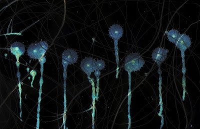
This is one of the mark-making images from last year. I miss the freedom of mark-making, I want to push myself to do more. Anyway, I made this by changing the colours on photoshop, it makes a decent computer background. I like it, however it's moving a little away from illustration but maybe the diversity doesn't matter.

Wildlife Background (full size when clicked on)


I made this image by re-using old college work and new illustrator files to get this effect. The purple character (Ste) was designed to have a mirror effect. The worm guy (Gerard) is supposed to be sinister looking even thought it was made in illustrator, as I was looking at Gerard Scarfe's imagery beforehand, so something he did had initiated this twisted evil spark.

Saturday 8 August 2009

Tracey Emin

Tracey Emin uses new and unusual media in her work. She brings techniques ranging from story-telling, drawing, film-making, installation, painting, neon, photography, appliquéd blankets and sculpture.


The use of neon is one of the most striking motifs in her work. Reflecting both the power of modern
advertising and it's wonderful tackiness, Emin's neon works have become some of her most
recognisable. That doesn't mean they don't say something too though, a work like 'You Forgot to Kiss
My Soul' (2001) expresses the frustrations, fears and hopes of an entire relationship.
Emin has grabbed the headlines for the graphic nature of some of her pieces, most notoriously 'My Bed'
(1998), in which the artist's unmade bed is strewn with the detritus of relationships past - including
used condoms and blood-stained underwear. Similarly 'Everyone I Have Ever Slept With 1963 - 1995'
(1995) was an honest and unsettling piece she created in an appliquéd tent, with names embroidered
inside representative of both shelter and restlessness.
I chose to research this contemporary artist as she is provocative and challenging. Her memorable and
intense work poses the question of the meaning of art today.People are fascinated by the raw openness
of her confessional work.
Emin is however, no stranger to criticism. Stephen Bayley dismissed her works as 'no better than a tea
bag' and along with Damien Hirst had 'abandoned beauty and embraced aesthetic outrage'. In her
defence of'My Bed' (1998), Emin states 'if people say the bed's a joke or a confidence trick I'd say
they're not very interested in art'. I find this piece particularly interesting as it forces the viewer to face
up to their own personal histories - memories that they may have chosen to repress.
Whatever people's opinions are of Emin, she is impossible to ignore, indeed the public visiting the
Tate's exhibition were much more visibly engaged by Emin's work than that of the other Turner Prize
nominees.


Damien Hurst

Damien Hurst is known as one of the young British artists and has many opinions about his work. In most of his art works, he combines animals and tanks, and most parts of his works, in my view express his feels and understanding of life.


Damien Hurst created the widely acclaimed 'freeze' exhibition in 1988 while still a student at Goldsmith college. This show launched the careers of many successful young British artists, including his own. Hirst graduated from Goldsmiths in 1989, and has since become the one of the most famous living British artist after David Hockney.
In 1991, Hirst brought forth 'In and out of love', an installation for which he filled a gallery with hundreds of live tropical butterflies, some spawned from monochrome canvases on the wall. With 'The Physical Impossibility of Death in the Mind of Someone Living' (1991), his infamous tiger shark in a glass tank of formaldehyde exhibited in the Saatchi Gallery. This is what made him well known.
Damien Hurst has lots of interests life and death which are well expressed in his works. His work also focuses on alienation and family hood. This is show in one of his main works of a half cut open cow in a tank.
Damien Hurst his expressed many areas of life that some people find offensive because these are areas concern them and in some cases challenge there ideas of thinking, similarly like most modern art of themes of sex, rape and death he is considered to be one of the greatest of modern artist and is why I like his art work.

Roy Lichtenstein

Roy Lichtenstein was born in 1923 and lived for 73 years, he died September 2nd, 1997. Lichtenstein was a popular figure in the world of American art. He took the ideas of comic book style pictures and advertisements and was categorized as a pop artist in the 60s. Unlike other abstract expressionists, Lichtenstein designed mimicking familiar images in popular culture. Using strong, bold, bright colours distinguished black outlines and patterns similar to that of Ben Day dots, Which lead him to create large quick works of art that were uniquely his own style.


This image is called 'in the car' and was painted by Lichtenstein in 1963 and is typical of his imagery. In this image the colour in areas only uses one colour as apposed to two, three or mixed colour most modern cartoon artists use. The movement lines all go straight and are almost parallel two each other so in a way this doesn't show movement that well. This image would work on a poster, leaflet or painting on a wall. Its simplicity makes it almost look like graffiti because of the thick black lines and dotty colouration. The one main thing I like about this image is it appears like a action seen because the driver look like he's driving at high speed and is about to ask something to the passenger but she seems uninterested in him and whatever is about to happen.

Roy Lichtenstein comic style painting are well consider in American art and is as well known as the artist Andy Warhol. This was a time period of mass-produced consumer goods and also popular urban life.


When he was 38 he painted 'look Mickey' which was his first picture to employ a comic as subject matter. For a previous fifteen years he had taught at Ohio State University, the State University of New York at Oswego and also Rutgers University. In the 1950s at the time of abstract expressionism, Lichtenstein was trying to create a unique personal style for his work, although without much success. 'Look Mickey' changed that, instead of a self created style, founded by the unique expression of the artists hand, Lichtenstein went anonymously, machine-made look like industrial technical methods of mass production.
He then went on to produce more images such as the 'drowning girl' and other more lifelike comic imagery in the 1960s. Most of which used the dotty technique on large sized canvases. Later in the 70s continued these techniques and created a large amount of mirror paintings.
The main thing I like about his paintings is his unique style of action in them, and the emotion in them. I prefer the pop action things to his Disney works, Lichtenstein uses bold block colour this is why his illustrations are made so quickly done and this is also a pop artist. One of the main things I like about his paintings is the emotion in them for example his painting called 'drowning girl' shows even though she is drowning she would rather cry over some guy called brad and looks she need theory and help for sinking in the violent waves. I find the dark blue hair interesting in the painting as it emphasizes the main problem at hand.
Roy Licthenstein is a good cartoon illustrator who paints a lot of the female gender, which is the main reason I like his artwork.

Synecdoche


I am afraid I do not know the artist who has cleverly used textiles here. The woman’s heart here, is clearly symbolic of a loving relationship between herself and the man. The heart is a synecdoche as it denotes part of the relationship between the couple. I feel that the artist was trying to emphasize that people have more than one emotion as he has double-outlined both characters. I feel that the man is more secure in their relationship because he’s defined in a solid colour, whereas, the woman is rather insecure as she’s in a washed colour and her outline is shakier.

Metonymy


I think this is a wonderfully simple and unambiguous illustration. This metonymic picture of skis for a winter Olympic challenge represents skiing and all winter sports overall (i.e. bob-sleighing). The different colours could easily represent the various countries competing in this Italian competition – i.e. symbolic of flags.

Metaphor


This circus picture is metaphoric in that the circus trainer is cracking the whip – i.e. he’s confidently displaying power over the animal. I think the pink circle could either be a circus ring or could be emphasizing movement (or indeed both)! I think activity and noise can be sensed through this picture.

Tuesday 4 August 2009

Wes Wilson

Wes Wilson is well known for his psychedelic, 60s Grapic posters. These in which promoted musicians of this age in time.


This above was one of the posters. The text on the right of the poster has been manipulated into a bone like shape that emphasizes the body next to it. a large mojority of this image is constructed by curly lines. This is creating a trippy/dreamy affect. Similarly the yellow eliminates from the black and draws your eye towards it, therefor creating this psychedelic effect. Both of these traits I would like to use in my art works. I think this works well as the symbol thats being held illustrates peace and freedom, leading you to beleive that this is a form of escape from day to day life.

Tuesday 14 July 2009

Useful words to use

a list of word that are useful as an illustrator, im learning about at the moment....

A
Abstract
Absurdity
Acrylic
Advertising
Agent
Allegory
Almanacs
Alphabet Books
Alternative Comics
Anatomical Illustration
Animation
Annuals
Anthropomorphism
Appropriation
Architectural Illustration
Archive
Art Deco
Art Director
Art Nouveau
Arts and Crafts Movement
Art School
Assemblage
Authorship
Avant-garde
B
Badges
Bayeux Tapestry
Beardsley, Aubrey
Bewick, Thomas
Blab!
Blake, William
Book Art
Book Jacket
Botanical Illustration
Brainstorming
Brandywine School
Brief
C
Caldecott, Randolph
Campaign
Caricature
Cartoon
Chapbook
Character
Chiaroscuro
Children's Books
Client
Collaboration
Collage
Colour
Comics
Commentary
Commission
Communication Skills
Composition
Computer-generated Imagery
(CGI)
Conceptual Illustration
Copyright
Corporate Illustration
Crane, Walter
Cruikshank, George
Cubism
Cutaways
D
Dada
Decoration
Diagram
Digital Revolution
Disney, Walt
Doodle
Doré, Gustave
Drawing
E
Editorial Illustration
Educational Illustration
Embroidery
Encyclopedia
Entertainment
Environmental Illustration
Etching
Ethics
Experimentation
Expressionism
F
Fantasy
Fashion Illustration
Felt-tip Pens
Fin de Siècle
Flyers
Folio Society
Folk Art
Frottage
G
Genres
Gillray, James
Golden Age
Graffiti
Graphic Design
Graphic Novels
Greenaway, Kate
Greetings Cards
H
Hand-drawn Type
Herbals
Hieroglyphics
Historical Illustration
Hogarth, William
Humour
Hyperrealism
I
Ideas
Illuminated Manuscripts
Illustrated Ape, The
Illustrated London News,
Imagination
Information
Inspiration
Internet
Interpretation
J
Juxtaposition
K
Kirby, Jack
Kitsch
Knitted Illustration
Kollwitz, Kàthe
Kramers Ergot
L
Le Gun
Life Drawing
Line
Linocut
Lithography
Live Painting
Livre d'artiste
Logo
M
Magazines
Manga
Maps
Marketing
Mark Making
Masereel, Frans
Medical Illustration
Merchandising
Mixed Media
Mono Print
Mosaic
Murals
Music Graphics
N
Narrative
Natural Sciences
New Yorker, The
Notebook
O
Observational Drawing
Organisations
Ornithological Illustration
Outsider Art
P
Packaging
Paint
Paper
Pen and Ink
Pencil
Personal Projects
Personification
Perspective
Persuasion
Photocopier
Photography
Photomontage
Pictogram
Pitch
Polish Posters
Political Illustration
Pop-ups
Portfolio
Portrait
Postcards
Poster, The
Potter, Beatrix
Printmaking
Psychedelic
Pulp Fiction
Punch
Punk
Push Pin Studios
R
Raster
Rebus
Reference
Renaissance
Reportage
Representational
Research
Retro
Rockwell, Norman
Romanticism
S
Satire
Scanner
Science Fiction
Scrapbooks
Scratchboard
Screen Printing
Self Promotion
Self Publishing
Sequential Illustration
Serendipity
Silhouette
Simplicissimus
Skateboard
Sketchbook
Software
Speech Bubble
Spot Illustration
Stamps
Steinberg, Saul
Stencil
Storyboard
Storytelling
Street Art
Studio
Style
Surrealism
Symbolism
T
Tattoo
Technical Illustration
Television Graphics
Tenniel, Sir John
Text and Image
Textiles
Three-dimensional projects
Thumbnail
Title Sequences
Toys
Traditional Illustration
Travel Illustration
Trends
Trompe l'oeil
T-shirt
Typography
U
Ukiyo-e
Urban Vinyl
V
Varoom"
Vector
Vernacular
Victorian Illustration
Video Jockeying
Vienna Secession
Vignette
Virtual Worlds
Visual Impact
Visual Language
Visual Metaphor
W
War Illustration
Watercolour
Websites
Where the Wild
Things Are
Whimsical
Window Display
Wit
Woodcut
Wood Engraving
Working Process
Y
Yellow Book, The
Yellow Submarine
Z
Zeitgeist
Zines

all above words from....
The Visual Dictionary Of Illustration.

Working on a new style

I feel i should go for, a blend of vector imagery that is not to complicated that shows shape as one element. Then a carful blend of background elements constructed by mark making, showing a texture in the background.

The hard part is the idea, What is the meaning behind it. I intend to do the folowing during the holidays...

Make a childrens book -adventure book.
> snows magical adventure (or something like that)

Design some rebus (not by words, but by thing) images that mean words.
> pirate
> music
> youth slang
> internet

Make a play city/town.
> music
> cyber
> playful

If any of these i want to take further i will do so.

Tuesday 30 June 2009

New age of simple/minimal art.


THIS ART IS ALL ABOUT FINDING THINGS WHICH YOU LIKE and taking it to it's simplist form. The idea being you can take any subject and make it fun. I think as an illustrator this is possibly one of the most important things to think about, but that's not to say this is the only thing that makes art works appear 'top dogs'.

Meaning would help better this style of art, which is probably something I need to consider more. When this is achieved, art can be enjoyed on a mass scale so the question is: Can you make a design that has meaning with a balance of style and humour?

Candy Garden Party sign


This was constructed by carfuly analyzing the letters and remaking them with geometric shapes, also this keeps the same slection of shapes for each letter. but the letter sizing changes to help this design layout.

More to this image than it first appears. For example the letters A and R in the words garden and party have this strange parallel thing happening.

I find this most intresting that curved lines could react as a softening affect against harsh pointy lines.

Mega Cool.

Thursday 25 June 2009

symbles


This is a very unusual collaboration of images. The semantics within the circles are initially ambiguous. Whilst the outlines have clear representations – humans, speech marks, chairs, urinating and an anchor for example – they simply don’t make sense as single symbols or signs.

It could possibly be a short narrative of the day of an office worker – split-second images that contributed to an individual’s working day – this is a white-collar worker under pressure who’s woken up hungover, and is startled by his loud smoke alarm alerting his fight or flight senses. The next caption shows other tenants within his building grouping on the stairs and following the fire procedure. He uses the fire escape and rejoices that he is unaffected by the blaze. After a letter regarding the building’s safety he goes to the toilet. The next two symbols indicate that he has post-traumatic stress as he is slightly disorientated and the red symbol indicates a brief examination from an occupational health nurse where his ability to function properly and not take time off work is considered. He questions himself on his ability as he’s rather shaky with additional apprehension with his scheduled meeting with his boss.

The white speech mark represents the briefing from his boss and the clear speech marks that follow show the individual relaying the information to workers underneath him in the hierarchy of the company.

The minimum wage workers peruse the new direction of the company, whilst our middle-management individual privately stresses over the briefing, leaving him exhausted. He goes to the pub and gets intoxicated. He then vomits in the green oval loo seats and awakes hungover with the knowledge that there is no chance of promotion for him within this company and the anchor represents his lack of mobility.

Or something like that!

Wednesday 24 June 2009

Darren Whittington


This is a postmodern selection of imagery from Darren Whittington who uses shapes to illustrate his vector drawings. He relies on semi-circles, circles and ovals and exaggerates them with heavy outlines. I think his artwork would benefit if he he used textures or patternation in his backgrounds.

Shoji Hamada – Bottle 1931


Hamada’s Anglo-Japanese style of pottery was innovative as he was influenced by Bernard Leach and set up his own pottery in St. Ives. I feel that colour is important here. Whilst my preference is usually for lighter colours I do like this vase’s earthy colours. The ‘slip’ is a lighter mix of clay, which is a fern colour which contrasts well against the darker brown glaze. I may use these colours in future as I find it paradoxical that ordinarily these colours are mixed together as camouflage in the army, yet in this instance they are used to bring forth the leafy Japanese motif.

Kandinsky


Kandinsky - Bow and Arrow 1927

Kandinsky was himself an accomplished musician and claimed that when he heard music he saw corresponding colours. The simplicity of this relationship for him, is evident here when he uses interlocking triangles and rectangles predominantly in warm red and yellow for the arc of the bow and creates a ‘heavenly’ blue circle as a cool subversive counterpoint to create tension. You can ‘hear’ the vibration of the bow through the wave shape.


Kandinsky – Klang (Sounds) 1907-12

I took information from ‘Kandinsky – The World’s Greatest Art’ (2006). Kandinsky considered this piece to be a gestamtkunstwerk as it is a universal and comprehensive synthesis of art, which combined picture, word and sound. This image is a clever construction which contrasts the yellow and black. Additionally, the shapes, trees, people and horse etc. are deliberately unambiguous and this is why the whole gestamtkunstwerk works as an ensemble.

(Artist unknown) Japanese Matchbox Design


This design is constructed out of six shapes that form hills and trees. The design uses texts which break up negative space. The design itself is unusual in that it only takes up quarter of the space. For me, this was particularly memorable as I researched it some time ago and have recently appropriated it subconsciously with obvious similarities.

Monday 22 June 2009

Shipman


Its a space ship and a man in one. Idea came form henna beads and tanker tours image. I know its a bit crude but at least its getting in the thinking mind set.

Christoph Niemann

Christoph uses a graphic approach to his illustrations. This is evident in his grid formulated design. He is an american illustrator that thinks more about problem solving than on artistic expression. When he gets a job he focuses on a idea then pics a media he feels would best suit this. he uses all sort of media form drawings to very vetor based design.


This tanker tours image cleverly usesing the bottem of the boat shape as a bomb and also uses the sea to help emphasize this and helps line up the text. I find this layout useful to better my own graphic approach.


There is three elements in this image, Altough it is unclear what is happening here. One narrative might be the government taking advantages of loop holes in the expenses row. Anther people being forced to vote for a certern party/gambling scam.


This image is construced with shapes, so semi-circle,triangles and rectangles. The forground objects colour, is a bit dark for my taste looks different from the background contrast wize. This one reminds me of the dinosaw head i made in a project.

Thursday 18 June 2009

Ian Wright

This is an image made up of Hama Beads. Wright makes faces / portraits out of unusual media. Perhaps try to contact him and ask him some questions about his work. This way of working must be very time consuming - how would he get it done when he has a tight deadline? Here is link that shows you how to use Hama Beads - it looks like real fun. It would be nice to see some of your characters done in this way.

Got an idea form this thank jo i will post it soon in the my work section of this blog.

Mayan Sculpture


These Mayan sculptures really remind me of your drawings, they are made up of parts / shapes joined together to make a character. It would be good to do some drawings based on these - see if you can find a book on either Mayan, Mexican or Aztec influences.

Thankyou jo,

Yes this is defently similar to my resent drawings. I will defantly see what jems i can find and post both on my blog and side file them. [kwl]

Friday 8 May 2009

Random image from Deviant Art


Dont no who its by aparerntly it by more that one person. I realy love the brave slection of colours and vast crazyness it holds. The long small train is hidden and acts the background, in this crazy mess


http://saddo-jdero.deviantart.com/art/Another-H-S-Illustration-74790888

Comparing two guest lecturers (Otto and Tal Rosner)

Resently at stockport, there has been many guest lectures and for this we were asked to post infomation about it. I intend to write some more about Otto and Tal Rosner, and hopefully this will better my general understanding of them.

Otto gave a very formulated lecture in that he spoke about how he self promoted himself first, then went on about his interests in shape and negative and positive space. Tal Rosner on the other hand also has strong interests in shape and patterning affects.

Tal uses recorded imagery and mashies up video footage to crate abstract movement that is similar to Otto in that he uses found imagery/hand made objects in a composition. Otto enjoys creation and development which i suppose all artist do in some way or another. Otto playfulness intellegence and spacial awareness, are clearly evedent in his work. Tal on the other hand uses the same methods but infrequently dose so, this is becauce he work with film and builds on an idea like in his doppleganger cilp.

In the financial market, Tal most likely gets paid more that Otto per commission, but overall Otto gets more over time as he gets more commissions. (proberly anyway)

Otto and Tal have similar personality thay both have drive to do tasks and have a clear understanding of what is both needed and wanted. Where thay differ, Otto has a hyper-attitude and Tal has a laid-back approach to work. Thats not to say Tal is lazy compared to Otto, not at all Tal works hard.

One of Tal's favourite things to do is duplicate video footage, Otto however enjoys playing with space so you can argue both are similar people at heart.

In my eyes Tal super cedes Otto with the finished out come. (even if Tal didnt respond to my email)Otto is good at what he dose but Tal has the edge. (I think anyways)Maybe im studying the wrong subject.

Wednesday 6 May 2009

Disgaea


Is my favourite all time manga. [Angels,Demons and Humans]The main character is laharl the son of the last overlord who choked to death on a apple core. He is on a quest to become the next overlord but he is consantly harrassed by two girls [Flonne and Etna]
sooo funny. Got the games and videos its mega.

8 Bit Music


Resently i have been infulanced a lot by 8 Bit music, it has helped me losen up my art work even more than it was before. I think a key point in my progression has been most defently being more playful and possibly a bit mad.

Pucca


Love Pucca. Yet again becauce its funny. Looks like it was completly made with illustrator and after effects. This is what mainly inspired me for the Dr Octogon brife i did not so long ago.

Pani Poni Dash


One of my all time favorite anime sesons. For two resons, firstly the humor in it completly over the top [a ten year old teacher that is constantly angry]. Secondly it goes from standard manga style to a video game like animation [very silly love it].

Secret Citys Project


This image is from a project where you could pick your own path, it was very open and let you be creative which was good, giving you lots of options. I firstly went on trips to gather research, at urbis there was a Hidden Manchester exhibishion by Andrew Paul Brooks. This work was of underground/up-high shots of Manchester. So from this i had the idea of hiding objects in things. Then i was looking at plumbing and body systems which is how this image progressed. The elements were put to gether in adobe illustrator.

Monday 27 April 2009

Steve Mack


Steve Mack email:

Hi Steve,
I am a second year student from Stockport College, Cheshire, England who’s working on an art blog and I’m a huge fan of your work. I find it has a refreshing simplicity and would be most grateful if you could answer a few questions.


As an illustrator yourself, do you experience difficulty multi-tasking work with your home life?

No, it's a balance but the great thing about being a freelancer is that I can find time to work and shift my days around as need be. I am not held to a daily routine and that flexibility allows me to be an illustrator, daddy and a husband. Life is busy but I wouldn't have it any other way!

Shape seems to be a big part of your illustrations, do you create grids as guide lines?

Shape is a big factor in my work as well as contrasting scale. I've never created a formula or grid. I just keep working at it till it feels "right" to my eye's.

Do you use side projects to help generate ideas for clients, or do you work strictly to briefs?

Most of the work I do is commissioned work for clients specific needs but I also do some fun things on the side to pitch to book publishers.


What type of material/media do you use?

I work completely digital in Adobe Illustrator.


Hi James,

Thanks for the email. I have answered

Best,
Steve
Steve Mack
Freelance Illustrator
Phone: 1.306.502.3394
Fax: 1.866.447.2834 (toll free)

Email: steve@illustrationfarm.com
Website: www.illustrationfarm.com
Blog: www.spotillustration.com
Contributing Author: Illustration Friday Blog

Sunday 26 April 2009

Nate Williams (N8W)


Hi Nate,
I am a second year student from Stockport College and I’m currently working on an art blog. I find your work really inspirational and unique, and would be most thankful if you could answer a few questions.

When you first started your commission work, did you look for clients or did you have an agent? Was this difficult?

When I first started out .. I looked for clients on my own. I mainly
contacted art directors by looking in the credits of magazine and
newspapers. An agent will definitely help get your work in front of
new people, but most illustrators with reps that I know continue with
their own marketing efforts in addition to their reps marketing
efforts.

With a website, RSS, Blog, Flickr, Facebook and Twitter marketing
your services have never been easier.


What media do you most enjoy using to create your works?

Sharpie Markers felt tip pens, India Ink and Photoshop .. I like my
work being reproduced as silkscreen


Colour is most definitely a good way for you to contrast layers, has anyone inspired you to do this or is it just natural talent?

I think I have been influenced not by one person but a genre of
silkscreen art and low technology printing.


Thanks for your time,

James Peters

Hey thanks

NATE WILLIAMS
Art, Illustration, Hand Lettering and Surface Patterns
iliketorelax@gmail.com
(206) 905-9654

WWW http://www.n8w.com
RSS http://feeds.feedburner.com/natewilliams
TWITTER http://twitter.com/n8w
Flickr http://www.flickr.com/photos/n8w/
LinkedIn http://www.linkedin.com/in/natewilliams


On Sun, Apr 19, 2009 at 5:45 PM, wrote:
>
> ################################
> Nate Williams Illustration
> ################################
>
> http://www.n8w.com/contact/

Sunday 19 April 2009

Drak Attack


Cityscape design, for a animation brife these where the background elements I used. Just simple hand crafed card shapes.

My toy town


This is something I was working on during the easter holidays. Playing with block shapes a texture from a bag. Kind of thing I would like to do.

Monday 9 March 2009

OTTO


Otto started his illustration career by firstly self promotion work. At college he enjoy drawing and collage work which developed into silk screen printing technique which he now uses as his main style. Otto has worked for various work places i.e. books in Leeds, postcard work, independent newspaper weekly for Saturdays, and so on. He originally felt that getting work is more important than, working at speed which changed with time. The work in editorials was good a self promotional media for him. He feels his work has improved over time. He thinks latterly and has a abstract approach, also scale, positive and negative space are important to him. He is very open to appropriation because he re-uses his own designs and others to make new ones and all so other art like Russian constructivism movement. He thinks that a important part of being a illustrator is having a good portfolio. He told us about how he gives clients four or five ruff ideas, this way the client has chose. The clients usually pic the simplist idea, Otto says and gose on to say its not always the best one. Some of his style is photography with a mix of flat shapes. Posture is something he also incorporates.

All above information from a class lecture at Stockport college.

web: http://www.ottoillustration.com/