Tuesday 27 July 2010

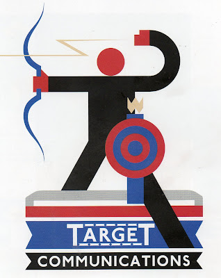
Art movement - London Underground Advertising


London Underground Advertising has been most influential to me; this image in particular is very much like my own. This is because it has similar shapes and a similar gridding system. It even has the same size ratio elements and the shapes properties/communications are very similar to mine have. It has a plain and simple property that spring forward, common to retro graphic design, which is why it is well suited to in the underground stations.

Art movement - Constructivism


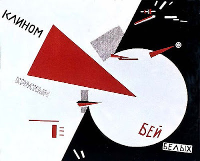
I have recently been looking at constructivism and have been analysing the geometry and Cyrillic script.
Limitations in letter forming and representing shapes as objects to form simplistic design, are really clever and are something I endeavour to work towards for future illustration. The typeface had bold shapes, which all appeared to be the same and were incredibly basic that created a strong dynamic impact.

Limitation


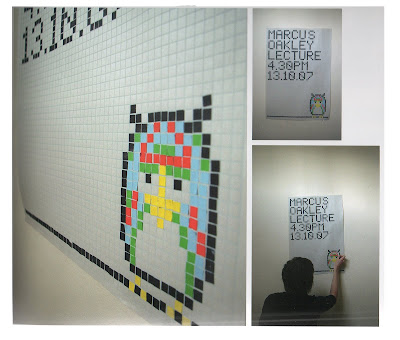
Limitation is important tool artists can adopt, here for example is a poster made from small square bits of card that have been arranged in a mosaic type way. It’s a good thing to adopt uniformity thru limitation as it will give a dynamic appeal, although sometimes it’s hard to work with a sketch or idea because they are lose and free.

3D EFFECTIVENESS


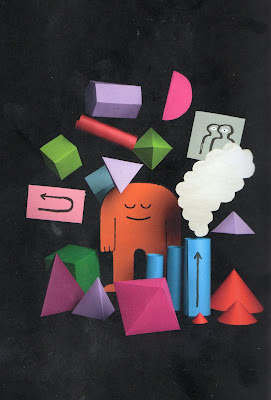
This image "MANYSTUFF" for Manystuff Magazine is said to have been for issues that focus on graphic design by Jean Jullien.
I feel 3 dimensional layering can induce more than just depth, it creates environment a space that flat images can’t emulate. I have tried to make 3d illustration models and have found having rough or unstrained edges works best when, blending a light colour into a dark colour. I would have to change the way I work to adapt a 3d style as my works are so formulated and structured by deteriorating the sides of the shapes.
This image shows this point well as it uses slightly scuffed cut elements and contrasts bright light and black. I have noted this in "little big planet" sharp clean edges for 3d illustration create an ugly dynamics but with slight scuff make it easier to take or read.
This is something I have contemplated in 2d as well but I feel sharpness works better when creating flatness, an absence of 3d but not depth as colour or pattern can indicate a 3d effect without being 3 dimensional.

Monday 26 July 2010

James Yang

My name is James Peters, I’m working on a blog for my illustration course (Degree) at Stockport College. The reason I am contacting you is because I will be fending for myself as an illustrator and I am scared about the concept of finding work, I have been looking at your work and dreaming of being as talented as you. I was hoping you wouldn't mind answering a few questions, please. I understand you may be very busy, but any time you could spare would be greatly appreciated.


[1] How did your experience at Virginia Commonwealth University have an impact on your work?


VCU at the time had a heavy influence from the Bauhaus school so there was a big emphasis on type, design, and concept. I was also lucky to have Phil Meggs as an instructor at the time who later wrote, "The History of Graphic Design". The appreciation for design helped me understand how illustration could be used in the context of design. I was also lucky to have had some talented classmates which always helps with your development.


[2] You frequently use the colours pink and blue a lot, is there a reason as why?


Not really. Joseph Albers was an early influence on how I think about color which is colors are very relational. I tend to think more intuitively now about colors and have been trying to simplify the pallet since I think this makes work seem more colorful. Hopefully this makes sense.


[3] Do you work hands on and finalize digitally, mostly digital or another way?


I sketch ideas on tracing paper then scan them into the computer. Most of the work is done in Photoshop. Occasionally I will scan inked or brushed drawing and elements to use in the final, but most of the work is done digitally these days.


[4] How open to change are you with a client and do you send them multiple concepts or variations?


I am very open to changes and will normally give the client 2-3 sketches. More than that makes you seem indecisive and sometimes too much choice is a bad thing for the client. It's my job to communicate a message the client needs. The tricky part is sometimes what they suggest is not what they really want, they just don't know how to communicate what they really mean, so you have to break it down and figure out what the really want. Most of my art directors do a good job of distilling this.


[5] Would you recommend joining an agency straight out of University as means of finding work and getting your work out there?


No, it's better to work for a little while on your own so you can learn the business. It helps you to know how to interact with clients, you learn about business practices, and will help you be more effective in working with an agent. The agent needs things from you to be successful so it helps if you've had experience on your own.


[6] Do you have any tips on what clients want to hear?


(reassurances). They mainly want to hear that you are listening to them and paying attention. I also like to let clients know when they can expect sketches and final so they are not wondering if you are on top of their project. Simple things like that.


[7] If any, which agencies have you used and do you have any favourites?


I've only been with the David Goldman Agency, so I guess he is my most and least favorite!


[8] You have given many talks and lectures do you have any words of the wise about the industry?


The best piece of advice is try to be a first rate you and not a second rate Picasso. Also, if you can have a healthy "dissatisfaction" about your work so you keep searching and improving, this is a big help for a long career. Staying in one place is fatal.

Tuesday 20 July 2010

Practitioners - Compare and Contrast


What will I be reflecting upon....
Compare and contrast the processes and practices of your two chosen practitioners, to what extent are they defined by the external rigours of the market place/industry they operate in?

During my time at Stockport I have had the opportunity of meeting a variety of practitioners, but being an illustrator, I find the illustrators most relevant to me are the artist I corresponded by email. I have chosen to compare Patrick Hruby and Ben Newman, being attracted to them because their style of illustration is similar to my own. I will be analysing and evaluating their working methods and practices to enable me to contrast and compare them. Also Tal Rosner as he has a long experience of work.

Firstly, Patrick was experimental in his early years as too was Ben, I think to have skills in geometrical design you have to be open to experimentation. I asked Patrick whether he found it hard to simplify his works, he responded by saying that,

"There is a bit of difficulty in any reductive style. I feel like there is an additional difficulty in what I do because there is a decorative aspect of my work that is in opposition to the idea of simplicity. It's maintaining the balance between the two so that they compliment each other that's the most difficult."

I interpreted this to mean that maintaining his simplistic theme is a complex balancing act between the simplistic and decorative aspects such as the plants and grass are added in their simplest forms, he makes decisions constantly about the levels of detail to be included in his images. This informs me that there is no one set way to illustrate, so I feel that it is imperative to be able to constantly adapt and change. Also, from this I can deduce that a balance I would not ordinarily have considered is endorsed.

Newman on the other hand has a different approach; his designs reflect the shape as opposed to the decorative content in his representations.

Hruby and Newman both acknowledge the importance of Art Director Agencies when it comes to generating work.
They have both capitalised and dominated the market very quickly since leaving their education, though the media and agents, i.e. they both have their own websites and are represented by ‘Illustration Mundo’ which is one of the biggest web sources to find illustrators, also both use agents to find work. Both illustrators use a geometric style and this comes in handy because it can be adopted for many illustration jobs such as media graphic design logos, magazine double page spreads, mini-story booklets, newspapers and so on. Ben Newman created a comic book called ‘Ouroboros’ which is currently being sold in art book shops which is selling well according to the store owner.

Due to the credit crunch it has become more and more difficult to find work straight from graduating, with the additional problem of more people now being educated to the same standard – i.e. competition is tough but I also regard it as healthy.
Some artists divide there time between working part time jobs for a guaranteed income whilst slowly building up his clientele which is far more likely to produce sporadic secondary income and I feel that this is typical of new graduates when starting off their career.
Patrick Hruby however, is more concerned about self-promotion and is in the fortunate position whereby he does not need to supplement his income with a regular part-time day job in addition.

For me, personally, I am not unduly concerned about finances at the moment. I have not got ‘fixed ideas’ as to whether or not to go it alone or work as part of a team. I am comfortable doing either essentially.
Tal Rosner was a famous guest lecturer at Stockport College and was truly a great inspiration. He is more experience than Hruby and Newman because his skills have increased over time and he has developed a maturity to his works. Although Newman and Hurby are relatively new they both are promoting themselves though merchandizing products and websites they don’t yet possess experience, which is what clients want to see. Building up over time, a verity of delightful products like Tal Rosner who has created many works developing his independent language has created trust for the buyer.

Is illustration work as readily available now as it was? Yes maybe more so but there is so much more competition in the second email I sent Hruby he said he struggled because of competition to get his foot on the ground but found work because his work is contemporary and state of the art.

I think it is hard to find work but as an illustrator you shouldn’t panic because you can’t find it especially when you’re just starting out. Overtime you build on the confidence you have gained and generally trust with clients.
Thursday 8 July 2010

Mark Ward

Hi Mark,

I have been admiring your work. I am in my final year at Stockport College. I do appreciate that you're probably busy, but I wonder if you'd mind answering a few questions......


Obviously you're unafraid of using vibrant colours, is your intention to shock the viewer with the vividness?


Nope- my pallette comes from my distorted view on Americana. It stems from candy wrappers, Saturday morning cartoons and varsity sports.


Do you work alone or have a team assisting you? And what is your opinion on this?

I work alone. For me it works best and I have complete control of my work aesthetic. If I come up with a grand concept that would need a Warholesque factory setup then I guess I would. It gives me more satisfaction to know all the work involved was created purely by me. I'm open to collaboration though if the right opportunity arose.


You use various mediums, do you have a preffered way of working? If so why is this your preference?

I have various methods due to the final output. If I need to do a magazine cover with editable elements, then it's pointless painting it. It needs to be A scalable vector file. For personal work, I like using aerosol and ink on paper or canvas due to the way the two work together. The colours pop and people look twice. They often think it's screenprinted. Rings true to the old method of making cartoons also with flat cell paint and ink.


Would you recommend using agencies straight after graduating?

Everyone has a different path. Whatever works for the individual.


Do you do promote yourself in any other way than through the internet?

Yes- magazines, t-shirts, collabs, my agent...


I especially like your skateboard works for Blueprint, how do you decide whether or not to use symmetry?


I don't think too hard about it. I wanted to do my take on a already distinct aesthetic of Blueprint. They use a lot of symmetry in their graphics... The concept usually drives my forms. The way I execute it is my aesthetic. You have to use both to create interesting work

Thank you very much for your time.


Yours sincerely,


James Peters.

Patrick Hruby


Hi Patrick,

You caught my attention with your 'A - Frame' illustration as I like the clever way you utilise simple shapes to emulate the objects.
I will be shortly graduating from Stockport College and I appreciate you are probably busy, but I wondered if you could posibly answer a few questions regarding your work for my personal blog.

Obviously shapes form the forefront of your work, have you always worked incorporating this system?


Early on in my education I experimented with a lot of approaches and styles. It wasn't until I got really involved with printmaking that I really solidified the system


Seemingly, plants, buildings and animals are the main focal points of your work, why? Do the shapes correlate with the objects?


Plants, animals, and buildings are obvious choices for the geometric system that I use. But I always enjoy the challenge of interpreting something new. For instance I just finished a children's book with AMMO Books (American Modern Books) about the circus, and I had to illustrate lots of people which I hadn't done a lot in my work before.


Do you find it difficult to maintain the simplicity of your work?


There is a bit of difficulty in any reductive style. I feel like there is an additional difficulty in what I do because there is a decorative aspect of my work that is in opposition to the idea of simplicity. It's maintaining the balance between the two so that they compliment each other that's the most difficult.


Children must love your work does it appeal as well to adults?


I've only just graduated and I haven't been out in the "real" world all that long, but so far I have done work that spans from the New York Times to Children's Books, I would like to think that this means that my work has wide appeal.


Would you recommend using agencies straight from University?


Going with an agency is a totally personal choice. I think the most important thing is to find an agency that works for you. I was lucky enough to get a recommendation to Friend and Johnson which ended up to be a great fit. All in all I think the most important thing is to have a plan on how you are going to get your work in front of Art Directors. Whether that's with an agent, through ad-base, or spending some time copying addresses in the magazine section at Borders.


How important is symmetry to you?


Symmetry is a powerful design tool. It holds a lot of historical meaning. There is something almost religious about it. Similarly a lot of folk art is symmetrical or at least has elements of symmetry. Lastly, it is impossible to ignore the symmetry of nature, which is a focal point in my work. That being said, I am not completely committed to symmetry and I use it only when I feel that it helps or supports the concept of a piece. Sometimes I will abandon it all together for a more dynamic composition.


Many thanks for you time,

Yours sincerely,

James Peters.

Monday 5 July 2010

Ben Newman


I asked Ben some questions and he kindly replied.

[1] How was your first experience of commissioned work and what impact did it have on your work?


My first commission came in my last year at University and I had to illustrate a poem about love. The excitement of seeing your work in print never gets boring. It can sometimes be frustrating though when your illustration gets altered just before it goes to print and you are unaware of the changes until you see the finish article. Luckily, that doesn’t happen too often. 


[2] You carefully use contrasting colours to emphasize lift, do you plan this initially?


Yes, very much so. I’m obsessed with colour and I always want my images to ping and sizzle by using a vibrant palette.

[3] What is your preferred media and how do you finalise your images? 


Everything I design is drawn by hand and traced on a light box. I use the computer to finalise my images and ready them for whichever medium they need to be printing in i.e. screen-printing, digital, litho, etc.

[4] Do clients tend to be flexible in their requirements or do they have specific briefs/ideas? 


It ranges dramatically. Most jobs I’ve done for AD agencies are very, very specific so you mainly concentrate on the aesthetic rather than the concept. Some clients will just give me a loose theme and then I go from there. Nobrow are my only client that give me pretty much complete and total control over my projects and that’s why I love working for them so much.

[5] Have you approached clients directly, or have you always relied upon agencies for work due to the recession? 


Luckily, clients approach me but I leave most of the contact work to my agent. I do portfolio runs around some of the London agencies from time to time.

[6] Do you have any tips on what clients want to hear? i.e. (reassurances)? 


Don’t wait for them to ask questions. Talk confidently and humbly about your work but don’t waffle on for too long. Clients see heaps of portfolios all the time so be direct, positive and amicable.

www.bennewman.co.uk
www.benhasapencil.blogspot.com