Thursday, 13 August 2009
Appropriation
How to easily appropriate art. I have remade this image in illustrator as you can see, this is consturucted by copying some of the sculptures propererties: shapes, scale and colour in this case.
Jesse Reno
First and foremost, I would like to reference Jayne Allen-Whittingham here as I read her post with interest. Jesse Reno was a dedicated autodidact as she had no formal education and simply drew her inspiration from a combination of contemporary pop and primitive ancient cultures of Africa and South America. She's inspirational to me as I would simply like to illustrate and do not feel that the critical studies side of my degree is especially relevant to the type of material I would like to produce. The pretentious art critics who adopt their own spin on their interpretation of other's work cannot possibly be inside the artist's head and therefore cannot appreciate raw expression. In the majority of cases, art critics overemphasize the art's semantics, resulting in incorrect information about the work as a whole and often mistakenly miss the simplicity and humour that the artist wanted to convey.
Jesse Reno has created a provocative and disturbing dark image here. The skeletal characater appears anguished and impoverished, the effect has been cleverly achieved by the use of vibrant colours interspersing a muddy background. My initial thoughts were that this image had a 'Brazilian' feel.
I think this image of 'Spoiled' looks like a 'Judgement Day for Animals'. An irregular sketch which incorporates both washed and blocks of colour. Linear streaks emphasize the shapes of the foreground characters.
This has a religious feel to it. The characters look like they're in coffins and that some crucifictions have occurred.
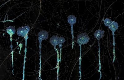
Paint Drip (Full size when Clicked on)
This is one of the mark-making images from last year. I miss the freedom of mark-making, I want to push myself to do more. Anyway, I made this by changing the colours on photoshop, it makes a decent computer background. I like it, however it's moving a little away from illustration but maybe the diversity doesn't matter.
Wildlife Background (full size when clicked on)
I made this image by re-using old college work and new illustrator files to get this effect. The purple character (Ste) was designed to have a mirror effect. The worm guy (Gerard) is supposed to be sinister looking even thought it was made in illustrator, as I was looking at Gerard Scarfe's imagery beforehand, so something he did had initiated this twisted evil spark.
Saturday, 8 August 2009
Tracey Emin
Tracey Emin uses new and unusual media in her work. She brings techniques ranging from story-telling, drawing, film-making, installation, painting, neon, photography, appliquéd blankets and sculpture.
The use of neon is one of the most striking motifs in her work. Reflecting both the power of modern
advertising and it's wonderful tackiness, Emin's neon works have become some of her most
recognisable. That doesn't mean they don't say something too though, a work like 'You Forgot to Kiss
My Soul' (2001) expresses the frustrations, fears and hopes of an entire relationship.
Emin has grabbed the headlines for the graphic nature of some of her pieces, most notoriously 'My Bed'
(1998), in which the artist's unmade bed is strewn with the detritus of relationships past - including
used condoms and blood-stained underwear. Similarly 'Everyone I Have Ever Slept With 1963 - 1995'
(1995) was an honest and unsettling piece she created in an appliquéd tent, with names embroidered
inside representative of both shelter and restlessness.
I chose to research this contemporary artist as she is provocative and challenging. Her memorable and
intense work poses the question of the meaning of art today.People are fascinated by the raw openness
of her confessional work.
Emin is however, no stranger to criticism. Stephen Bayley dismissed her works as 'no better than a tea
bag' and along with Damien Hirst had 'abandoned beauty and embraced aesthetic outrage'. In her
defence of'My Bed' (1998), Emin states 'if people say the bed's a joke or a confidence trick I'd say
they're not very interested in art'. I find this piece particularly interesting as it forces the viewer to face
up to their own personal histories - memories that they may have chosen to repress.
Whatever people's opinions are of Emin, she is impossible to ignore, indeed the public visiting the
Tate's exhibition were much more visibly engaged by Emin's work than that of the other Turner Prize
nominees.
Damien Hurst
Damien Hurst is known as one of the young British artists and has many opinions about his work. In most of his art works, he combines animals and tanks, and most parts of his works, in my view express his feels and understanding of life.
Damien Hurst created the widely acclaimed 'freeze' exhibition in 1988 while still a student at Goldsmith college. This show launched the careers of many successful young British artists, including his own. Hirst graduated from Goldsmiths in 1989, and has since become the one of the most famous living British artist after David Hockney.
In 1991, Hirst brought forth 'In and out of love', an installation for which he filled a gallery with hundreds of live tropical butterflies, some spawned from monochrome canvases on the wall. With 'The Physical Impossibility of Death in the Mind of Someone Living' (1991), his infamous tiger shark in a glass tank of formaldehyde exhibited in the Saatchi Gallery. This is what made him well known.
Damien Hurst has lots of interests life and death which are well expressed in his works. His work also focuses on alienation and family hood. This is show in one of his main works of a half cut open cow in a tank.
Damien Hurst his expressed many areas of life that some people find offensive because these are areas concern them and in some cases challenge there ideas of thinking, similarly like most modern art of themes of sex, rape and death he is considered to be one of the greatest of modern artist and is why I like his art work.
Roy Lichtenstein
Roy Lichtenstein was born in 1923 and lived for 73 years, he died September 2nd, 1997. Lichtenstein was a popular figure in the world of American art. He took the ideas of comic book style pictures and advertisements and was categorized as a pop artist in the 60s. Unlike other abstract expressionists, Lichtenstein designed mimicking familiar images in popular culture. Using strong, bold, bright colours distinguished black outlines and patterns similar to that of Ben Day dots, Which lead him to create large quick works of art that were uniquely his own style.
This image is called 'in the car' and was painted by Lichtenstein in 1963 and is typical of his imagery. In this image the colour in areas only uses one colour as apposed to two, three or mixed colour most modern cartoon artists use. The movement lines all go straight and are almost parallel two each other so in a way this doesn't show movement that well. This image would work on a poster, leaflet or painting on a wall. Its simplicity makes it almost look like graffiti because of the thick black lines and dotty colouration. The one main thing I like about this image is it appears like a action seen because the driver look like he's driving at high speed and is about to ask something to the passenger but she seems uninterested in him and whatever is about to happen.
Roy Lichtenstein comic style painting are well consider in American art and is as well known as the artist Andy Warhol. This was a time period of mass-produced consumer goods and also popular urban life.
When he was 38 he painted 'look Mickey' which was his first picture to employ a comic as subject matter. For a previous fifteen years he had taught at Ohio State University, the State University of New York at Oswego and also Rutgers University. In the 1950s at the time of abstract expressionism, Lichtenstein was trying to create a unique personal style for his work, although without much success. 'Look Mickey' changed that, instead of a self created style, founded by the unique expression of the artists hand, Lichtenstein went anonymously, machine-made look like industrial technical methods of mass production.
He then went on to produce more images such as the 'drowning girl' and other more lifelike comic imagery in the 1960s. Most of which used the dotty technique on large sized canvases. Later in the 70s continued these techniques and created a large amount of mirror paintings.
The main thing I like about his paintings is his unique style of action in them, and the emotion in them. I prefer the pop action things to his Disney works, Lichtenstein uses bold block colour this is why his illustrations are made so quickly done and this is also a pop artist. One of the main things I like about his paintings is the emotion in them for example his painting called 'drowning girl' shows even though she is drowning she would rather cry over some guy called brad and looks she need theory and help for sinking in the violent waves. I find the dark blue hair interesting in the painting as it emphasizes the main problem at hand.
Roy Licthenstein is a good cartoon illustrator who paints a lot of the female gender, which is the main reason I like his artwork.
Synecdoche
I am afraid I do not know the artist who has cleverly used textiles here. The woman’s heart here, is clearly symbolic of a loving relationship between herself and the man. The heart is a synecdoche as it denotes part of the relationship between the couple. I feel that the artist was trying to emphasize that people have more than one emotion as he has double-outlined both characters. I feel that the man is more secure in their relationship because he’s defined in a solid colour, whereas, the woman is rather insecure as she’s in a washed colour and her outline is shakier.
Metonymy
I think this is a wonderfully simple and unambiguous illustration. This metonymic picture of skis for a winter Olympic challenge represents skiing and all winter sports overall (i.e. bob-sleighing). The different colours could easily represent the various countries competing in this Italian competition – i.e. symbolic of flags.
Metaphor
This circus picture is metaphoric in that the circus trainer is cracking the whip – i.e. he’s confidently displaying power over the animal. I think the pink circle could either be a circus ring or could be emphasizing movement (or indeed both)! I think activity and noise can be sensed through this picture.
Tuesday, 4 August 2009
Wes Wilson
Wes Wilson is well known for his psychedelic, 60s Grapic posters. These in which promoted musicians of this age in time.
This above was one of the posters. The text on the right of the poster has been manipulated into a bone like shape that emphasizes the body next to it. a large mojority of this image is constructed by curly lines. This is creating a trippy/dreamy affect. Similarly the yellow eliminates from the black and draws your eye towards it, therefor creating this psychedelic effect. Both of these traits I would like to use in my art works. I think this works well as the symbol thats being held illustrates peace and freedom, leading you to beleive that this is a form of escape from day to day life.
Subscribe to:
Posts (Atom)