Monday, 7 November 2011
Looking for Work !!
Hello Blog world, anyone have any tips on finding work in the design world, would be nice if pleople could share there ideas on jobs they have found. New and crazy ideas would be grate as well as more traditional methods.
Friday, 13 August 2010
Current commission work
Resently I have been making a logo for a charity and have worked planed to make the buttons for ebay companys,I'm getting a taste of work in the real world and have also aranged to sell t-shirts with my colleagues.
Tuesday, 27 July 2010
Art movement - London Underground Advertising

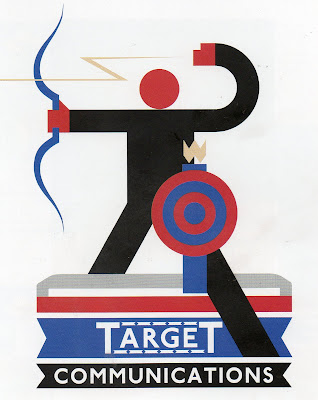
London Underground Advertising has been most influential to me; this image in particular is very much like my own. This is because it has similar shapes and a similar gridding system. It even has the same size ratio elements and the shapes properties/communications are very similar to mine have. It has a plain and simple property that spring forward, common to retro graphic design, which is why it is well suited to in the underground stations.
Art movement - Constructivism

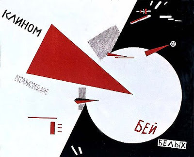
I have recently been looking at constructivism and have been analysing the geometry and Cyrillic script.
Limitations in letter forming and representing shapes as objects to form simplistic design, are really clever and are something I endeavour to work towards for future illustration. The typeface had bold shapes, which all appeared to be the same and were incredibly basic that created a strong dynamic impact.
Limitation

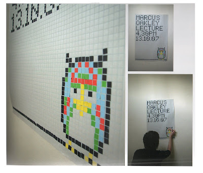
Limitation is important tool artists can adopt, here for example is a poster made from small square bits of card that have been arranged in a mosaic type way. It’s a good thing to adopt uniformity thru limitation as it will give a dynamic appeal, although sometimes it’s hard to work with a sketch or idea because they are lose and free.
3D EFFECTIVENESS

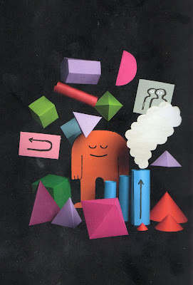
This image "MANYSTUFF" for Manystuff Magazine is said to have been for issues that focus on graphic design by Jean Jullien.
I feel 3 dimensional layering can induce more than just depth, it creates environment a space that flat images can’t emulate. I have tried to make 3d illustration models and have found having rough or unstrained edges works best when, blending a light colour into a dark colour. I would have to change the way I work to adapt a 3d style as my works are so formulated and structured by deteriorating the sides of the shapes.
This image shows this point well as it uses slightly scuffed cut elements and contrasts bright light and black. I have noted this in "little big planet" sharp clean edges for 3d illustration create an ugly dynamics but with slight scuff make it easier to take or read.
This is something I have contemplated in 2d as well but I feel sharpness works better when creating flatness, an absence of 3d but not depth as colour or pattern can indicate a 3d effect without being 3 dimensional.
Monday, 26 July 2010
James Yang
My name is James Peters, I’m working on a blog for my illustration course (Degree) at Stockport College. The reason I am contacting you is because I will be fending for myself as an illustrator and I am scared about the concept of finding work, I have been looking at your work and dreaming of being as talented as you. I was hoping you wouldn't mind answering a few questions, please. I understand you may be very busy, but any time you could spare would be greatly appreciated.
[1] How did your experience at Virginia Commonwealth University have an impact on your work?
VCU at the time had a heavy influence from the Bauhaus school so there was a big emphasis on type, design, and concept. I was also lucky to have Phil Meggs as an instructor at the time who later wrote, "The History of Graphic Design". The appreciation for design helped me understand how illustration could be used in the context of design. I was also lucky to have had some talented classmates which always helps with your development.
[2] You frequently use the colours pink and blue a lot, is there a reason as why?
Not really. Joseph Albers was an early influence on how I think about color which is colors are very relational. I tend to think more intuitively now about colors and have been trying to simplify the pallet since I think this makes work seem more colorful. Hopefully this makes sense.
[3] Do you work hands on and finalize digitally, mostly digital or another way?
I sketch ideas on tracing paper then scan them into the computer. Most of the work is done in Photoshop. Occasionally I will scan inked or brushed drawing and elements to use in the final, but most of the work is done digitally these days.
[4] How open to change are you with a client and do you send them multiple concepts or variations?
I am very open to changes and will normally give the client 2-3 sketches. More than that makes you seem indecisive and sometimes too much choice is a bad thing for the client. It's my job to communicate a message the client needs. The tricky part is sometimes what they suggest is not what they really want, they just don't know how to communicate what they really mean, so you have to break it down and figure out what the really want. Most of my art directors do a good job of distilling this.
[5] Would you recommend joining an agency straight out of University as means of finding work and getting your work out there?
No, it's better to work for a little while on your own so you can learn the business. It helps you to know how to interact with clients, you learn about business practices, and will help you be more effective in working with an agent. The agent needs things from you to be successful so it helps if you've had experience on your own.
[6] Do you have any tips on what clients want to hear?
(reassurances). They mainly want to hear that you are listening to them and paying attention. I also like to let clients know when they can expect sketches and final so they are not wondering if you are on top of their project. Simple things like that.
[7] If any, which agencies have you used and do you have any favourites?
I've only been with the David Goldman Agency, so I guess he is my most and least favorite!
[8] You have given many talks and lectures do you have any words of the wise about the industry?
The best piece of advice is try to be a first rate you and not a second rate Picasso. Also, if you can have a healthy "dissatisfaction" about your work so you keep searching and improving, this is a big help for a long career. Staying in one place is fatal.
Subscribe to:
Comments (Atom)